
The Top 10 Best Fonts for Your Resume in 2025
Trust Score: 4.7
381 reviews
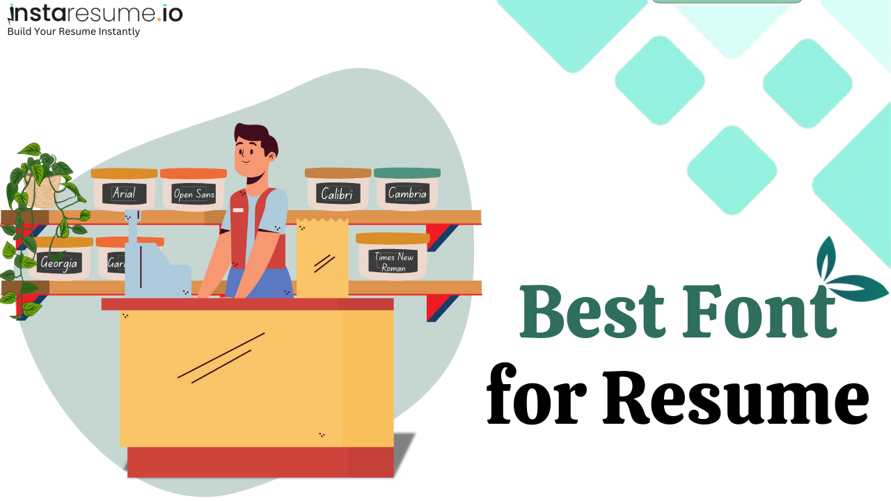
Table of Contents
Introduction
When it comes to landing a job interview, your resume design can be just as important as its content. One of the most overlooked (yet impactful) design elements? Your resume font.
Choosing the right font can elevate your resume, making it easier to read, more professional, and more tailored to your industry. The wrong font? It can make your resume look outdated, cluttered, or just hard to scan.
In his blog, we’ll break down:
 What fonts are best for resumes
- Different types of fonts and how they affect readability
- The top 10 resume fonts in 2025 (with real examples)
- Industry-wise font recommendations
- Font size best practices
- Formatting rules you shouldn’t ignore
- What to avoid when picking a resume font
What Is the Best Font for a Resume in 2025?
In 2025, the best resume fonts are those that are clean, professional, easy to read both on-screen and in print, and compatible with Applicant Tracking Systems (ATS). Sans-serif fonts continue to dominate due to their modern appearance and readability, though serif fonts still have a place in traditional or academic settings.
Top Resume Fonts in 2025
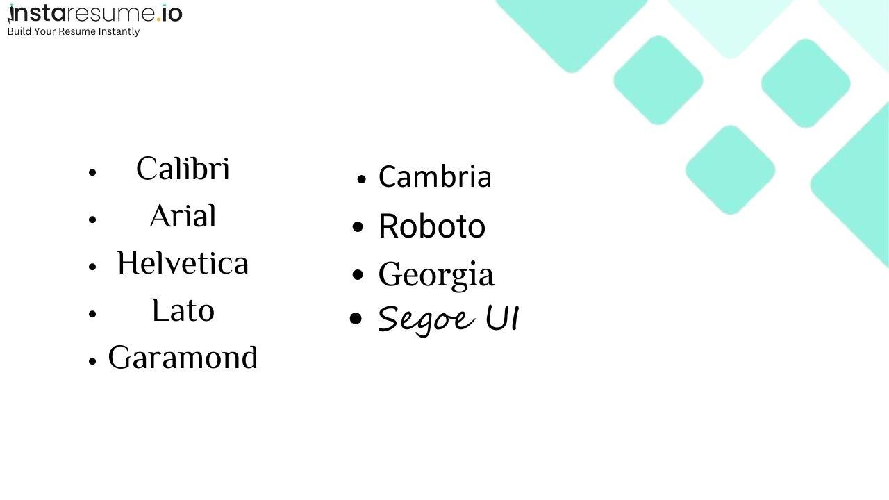
1. Calibri
A default Microsoft font known for its clean, modern look. It's widely accepted and ATS-friendly.
Best for: Finance, administration, corporate, healthcare.
2. Arial
Simple, widely compatible, and neutral in tone.
Best for: Legal, government, education, healthcare.
3. Helvetica
A design-friendly sans-serif font that offers a clean, modern aesthetic. Best used in PDFs.
Best for: Marketing, design, media, creative roles.
4. Lato
A modern, slightly rounded font with a friendly yet professional feel.
Best for: Startups, product management, sales, digital marketing.
5. Garamond
An elegant serif font that works well for traditional fields or when applying to academic positions.
Best for: Academia, humanities, publishing, research roles.
6. Cambria
Designed for on-screen reading with excellent print clarity, Cambria is a serif font with a modern touch.
Best for: Education, legal, administrative, consulting.
7. Roboto
A Google-designed font known for clarity and modern appeal. Works well in both printed and digital formats.
Best for: Tech, engineering, software development, UX/UI.
8. Georgia
A classic serif font with high readability. It bridges traditional styling with digital accessibility.
Best for: Education, nonprofit, communications, journalism.
9. Segoe UI
Used in many Microsoft products, this sans-serif font is modern and neutral.
Best for: Tech support, business analysis, customer service, HR.
Related: How To Make a Comprehensive Resume (With Examples)
Font Guidelines by Industry
- Corporate (Finance, Consulting, HR): Calibri, Arial, Cambria
- Tech (Software, Data Science, Engineering): Roboto, Segoe UI, Calibri
- Creative (Design, Marketing, Media): Helvetica, Lato, Montserrat
- Academic (Education, Research, Humanities): Garamond, Georgia, Cambria
- Healthcare (Nursing, Medical Admin, Public Health): Calibri, Arial, Georgia
- Startups (Product, Growth, Strategy): Lato, Roboto, Helvetica
Best Practices
- Font size: 10–12 pt for body text, 14–16 pt for headings.
- Use one font consistently throughout your resume for a clean and unified look.
- Avoid overly stylized or outdated fonts like Comic Sans, Papyrus, or Courier.
- Save your resume as a PDF to preserve formatting unless the employer requests a different format.
How Many Types of Fonts Are There?
When choosing a font for your resume, it's important to understand the type of font you're selecting and whether it aligns with your industry and role. Fonts generally fall into four main categories:
1. Serif Fonts
Serif fonts feature small decorative strokes or "feet" at the ends of each letter. These fonts project a sense of tradition, reliability, and professionalism.
- Best for: Academia, law, finance, and other traditional or formal industries.
- Examples: Times New Roman, Georgia
2. Sans-Serif Fonts
Sans-serif fonts are clean, modern, and easy to read, especially on screens. They lack the decorative strokes of serif fonts, offering a minimalist and contemporary look.
- Best for: Tech, marketing, design, startups, and general business roles.
- Examples: Helvetica, Calibri, Lato, Segoe UI
3. Monospace Fonts
In monospace fonts, each character occupies the same amount of horizontal space. These fonts are generally used in technical fields, particularly for showcasing code or data alignment.
- Best for: Software development, data analysis, IT, or roles that require showcasing programming skills.
- Examples: Courier New, Consolas
4. Display Fonts
Display fonts are decorative and stylized. While visually striking, they can distract from the content and reduce readability. Use sparingly and only in creative portfolios or branding-focused resumes.
- Best for: Graphic design, creative portfolios, or resumes submitted as part of a visual identity.
- Examples: Pacifico, Lobster
- Note: Generally not recommended for standard resumes.
Top 10 Best Resume Fonts in 2025 (With Real Examples)
Choosing the right font can shape how recruiters perceive your resume and ensure it passes through Applicant Tracking Systems (ATS). Here’s your go-to list of fonts that combine readability, style, and professionalism:
1. Calibri
- Pros: Modern, default in Microsoft Word, highly readable
- Cons: Slightly overused
- Best for: Corporate roles, admin, finance, healthcare
2. Helvetica
- Pros: Sleek, clean, minimalistic; ideal for tech and design
- Cons: Not free on all platforms
- Best for: Design, tech, startups
3. Georgia
- Pros: Professional with a classic touch, highly legible on screens
- Cons: Slightly old-fashioned for creative roles
- Best for: Education, law, public sector
4. Garamond
- Pros: Elegant and timeless; uses less ink when printing
- Cons: May feel too traditional for modern industries
- Best for: Academia, research, editorial roles
5. Roboto
- Pros: Clean, modern, Google-designed; excellent on screens
- Cons: Slightly mechanical aesthetic
- Best for: Engineering, tech, data science
6. Lato
- Pros: Friendly, approachable, and clean aesthetics
- Cons: Not installed by default on all systems
- Best for: Startups, marketing, HR, business development
7. Cambria
- Pros: Designed for readability in print and digital formats
- Cons: Feels more traditional
- Best for: Consulting, education, corporate communications
8. Avenir
- Pros: Modern and geometric; blends professionalism with creativity
- Cons: Not pre-installed; may require a license
- Best for: Branding, UX/UI, creative leadership roles
9. Trebuchet MS
- Pros: Strong on-screen readability; modern sans-serif style
- Cons: Less commonly used in resumes
- Best for: Digital media, education, customer service
How to Apply Different Fonts in the River and Universe Templates on InstaResume
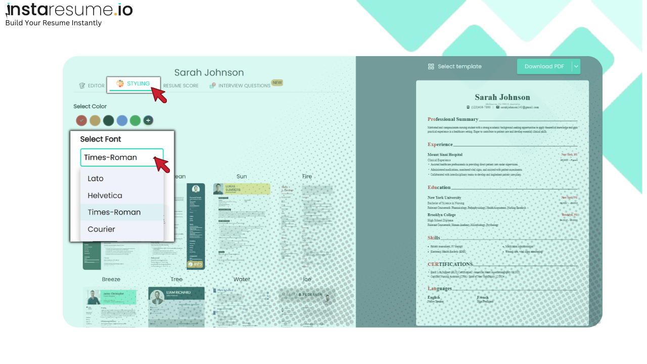
Customizing your resume’s font can enhance its visual impact and better align it with your target industry. Follow these steps to apply different fonts using InstaResume’s River or Universe templates:
Step 1: Open InstaResume
Go to InstaResume.io and log in to your account. If you’re a new user, you can sign up for free.
Step 2: Build Your Resume
Start by entering all your resume content—personal details, work experience, education, skills, etc.—using the guided form.
Step 3: Navigate to the Styling Section
Once your content is complete, go to the "Styling" or "Design" section of the tool. This is where you can customize the visual layout of your resume.
Step 4: Select the River or Universe Template
In the template selection panel, choose either the River or Universe template based on your preference. These templates are designed to support advanced styling options, including font selection.
Step 5: Locate the Font Settings Panel
After selecting your template, scroll to the section labeled “Fonts” or “Font Style.” Here, you’ll see a dropdown or set of categories offering multiple font groups.
Step 6: Choose a Font Group
Select from the available font groups—such as Modern, Classic, Professional, or Creative. Each group contains curated fonts optimized for both design and ATS readability.
Examples of font groups might include:
- Professional (e.g., Calibri, Cambria)
- Modern (e.g., Roboto, Lato)
- Creative (e.g., Avenir, Helvetica)
Step 7: Preview the Changes
Once a font group is selected, the resume preview on the right will update in real time to reflect your changes. This allows you to instantly see how your resume will look with the new fonts.
Step 8: Adjust Headings and Body Font Separately (Optional)
If supported, you can further customize fonts for headings vs. body text. For example, you might use Georgia for headings and Lato for body text.
Step 9: Save and Download
Once satisfied with the font and design, click “Save” and then “Download” your resume in PDF format. Your selected fonts will be embedded in the final version.
Pro Tip:
What to Avoid When Choosing a Resume Font
While selecting a font for your resume may seem like a minor detail, the wrong choice can impact readability, professionalism, and even your chances of passing through Applicant Tracking Systems (ATS). Here’s what you should steer clear of:
❌ Overly Decorative or Script Fonts
- Fonts like Comic Sans, Papyrus, Curlz MT, or Brush Script may look creative but are not suitable for professional documents.
- These fonts can make your resume look unpolished or childish, and they’re often hard to read.
❌ Inconsistent Font Use
- Using multiple fonts across different sections creates a chaotic and disjointed appearance.
- Stick to one primary font or, at most, one font for headings and one for body text.
❌ Fonts That Are Not ATS-Compatible
- ATS software may not recognize non-standard or custom fonts, causing formatting issues or missed content.
- Avoid fonts that require installation or are not widely supported (e.g., Pacifico, Lobster, or any image-based text).
❌ Too Small or Too Large Font Sizes
- Using fonts smaller than 10 pt can make your resume hard to read, while larger than 12 pt (for body text) can appear unprofessional or take up too much space.
❌ Fonts That Don’t Match Your Industry
- For example, Times New Roman may be too old-fashioned for a tech startup, while Avenir might feel too casual for legal or academic roles.
- Align font style with the tone of your industry and role.
❌ All Caps or Excessive Styling
- Avoid using ALL CAPS for large sections—it’s hard to read and comes off as aggressive.
- Likewise, avoid overusing bold, italic, underline, or colors, which can clutter the design and distract from your content.
❌ Low Contrast Fonts
- Light grey text or thin-stroke fonts can look elegant but are hard to read on screen or print.
- Always test readability before finalizing your resume.
Conclusion
Choosing the right resume font in 2025 is more than just a design decision—it’s about professionalism, readability, and ATS compatibility. Whether you're applying for corporate, creative, or tech roles, the right font can subtly boost your chances of making a great first impression. Stick to clean, modern, and industry-appropriate typefaces, and always prioritize clarity over flair. Your resume’s content matters—but how it looks can help it get read.
Equally important is ensuring your font choice aligns with industry standards. Fonts like Calibri or Arial are universally accepted, while fonts like Helvetica or Roboto add a modern touch for tech and creative positions. By tailoring your resume’s font to the specific job or sector, you not only present a professional image but also demonstrate your understanding of the industry’s expectations.
Finally, remember that simplicity is key. Avoid cluttered designs or excessive use of different fonts, which can distract from your qualifications. Opt for a clean, well-structured layout with one or two professional fonts, and your resume will stand out for all the right reasons.
Frequently Asked Questions (FAQs) About Resume Fonts in 2025
1. What is the best font for a resume in 2025?
In 2025, the best resume fonts are those that balance professionalism, readability, and compatibility with Applicant Tracking Systems (ATS). Top choices include Calibri, Helvetica, Roboto, and Lato. These fonts are clean, modern, and widely accepted across various industries, making them ideal for job applications in the United States and globally. Using these fonts ensures your resume is easily readable by both hiring managers and ATS software, increasing your chances of landing an interview.
2. Are there any fonts I should avoid on my resume?
Yes, certain fonts can negatively impact your resume's effectiveness. Avoid overly decorative or script fonts like Comic Sans, Papyrus, and Brush Script, as they can appear unprofessional and are often difficult to read. These fonts may also be incompatible with ATS, leading to parsing errors. For a professional resume, stick to clean, standard fonts that convey seriousness and clarity.
3. How does font choice affect ATS compatibility?
Applicant Tracking Systems (ATS) are used by many employers to screen resumes. Fonts that are too stylized or uncommon may not be recognized correctly by ATS, causing your resume to be misread or rejected. To ensure ATS compatibility, use standard fonts like Arial, Calibri, or Times New Roman, which are easily parsed by most systems. This is especially important for job seekers in the U.S., where ATS usage is prevalent.
4. What font size should I use on my resume?
The ideal font size for resume body text is between 10 and 12 points, ensuring readability without consuming excessive space. Section headings can be slightly larger, typically between 14 and 16 points, to distinguish different sections clearly. Your name at the top of the resume can be even larger, around 18 to 22 points, to make it stand out. Consistent font sizing contributes to a professional and organized appearance.
5. Can I use more than one font on my resume?
While it's best to maintain consistency, using two complementary fonts can enhance your resume's visual appeal. For example, you might use a sans-serif font like Helvetica for headings and a serif font like Georgia for body text. Ensure that both fonts are professional and easy to read. Avoid mixing too many fonts, as this can make your resume look cluttered and unprofessional.
6. Are there specific fonts recommended for different industries?
Yes, certain fonts align better with specific industries:
- Corporate and Finance: Calibri, Cambria, Garamond
- Creative Fields: Helvetica, Lato, Avenir
- Technology: Roboto, Arial, Verdana
- Legal and Academic: Times New Roman, Georgia, Book Antiqua
7. How do I choose a font that stands out but remains professional?
To make your resume stand out while maintaining professionalism, select a clean, modern font that's less commonly used but still widely accepted, such as Montserrat or Open Sans. Pairing such fonts with a well-organized layout and clear headings can enhance readability and visual appeal. Remember, simplicity and clarity often make a stronger impression than overly stylized designs.
8. Should I use the same font in my cover letter and resume?
Yes, using the same font in both your resume and cover letter ensures consistency and a cohesive look. This uniformity reflects attention to detail and professionalism. Ensure that the font is appropriate for both documents and maintains readability across different devices and formats.
9. Do fonts affect the length of my resume?
Yes, different fonts can slightly alter the length of your resume due to variations in character width and spacing. For instance, Arial tends to take up more space than Calibri. If you're trying to fit your resume onto one page, consider using a more compact font like Calibri or Garamond. However, never compromise readability for space; it's better to have a well-formatted two-page resume than a cramped one-page document.
10. Are there any tools to help me choose the right resume font?
Yes, several online resume builders and templates can assist in selecting the appropriate font. Platforms like InstaResume, Canva, and Zety offer professionally designed templates with pre-selected fonts optimized for readability and ATS compatibility. These tools can streamline the resume creation process and help ensure your document meets current standards.